Dallas-based designer Kristin Mullen shares what inspires her work and how she changed her current home from a 1980s snapshot to an elegant yet functional space for her family.

Have you always been interested in design? Who or what influenced you to join this field?
My mother was a self-taught home decorator and loved the process. Since my dad traveled frequently, she would pass the time by rearranging the furniture at night, putting pieces on towels or rugs to move them easily. I’d wake up to find the rooms transformed, often after hearing mysterious hammering the night before.
That said, I personally don’t have the typical designer origin story. The closest I came to that was playing with my dollhouse and helping with displays at my mother’s clothing store. My real interests have always been history, storytelling, and traveling. My mom also loved antiques, as do I. She favored American ones, whereas I lean toward Swedish and clean-lined French. I didn’t start working as a professional designer until around 2005. Before that, I just worked on my own home and casually helped friends with theirs. They’d offer a glass of wine as thanks. [Laughs]
Things shifted when my husband and I moved our family to Dallas. One friend asked me to design her dining room and insisted on paying me. Word spread, and soon other friends began hiring me. What began as very part-time work quickly evolved into a full-time profession.
What did you do before starting your firm?
I majored in speech and language pathology in college and minored in theater: quite different from interior design! I actually worked as an actress then stayed home after starting my family.
Tell us about your travels. Which countries influence your aesthetic the most?
I’ve lived abroad and traveled extensively. My biggest influence, perhaps surprisingly, is Japan. My work doesn’t look Japanese, but while living there, I took ikebana classes and learned to appreciate the power of negative space and balance over symmetry. I also embraced the idea that imperfection can be beautiful.
European design also influences me heavily. Europeans often live in smaller spaces, so every item is thoughtfully chosen and I appreciate their willingness to incorporate whimsy and imperfection. While residing in England, I often visited friends’ homes in France and got to see how people really live, not just the showy side.
When did you buy your current home, and what condition was it in?
We bought it in December 2021. It was very 1980s: pink tiles, wallpaper, carpet, shiny brass, and oddly shaped wall openings. But the exterior was charming, with storybook-like rooflines, and the layout had generous living spaces and a large primary suite. It’s also a single-story home, which was important for our daughter, who has cerebral palsy. I saw a lot of potential.
How much of it did you change structurally?
We closed some walls, opened others, and made a laundry room out of our third-car garage. I tried to respect the existing footprint as much as possible while making it more functional. The kitchen layout was changed to open into the family room. I also converted the dining room into my study. In all, it took about nine months because of appliance shortages at the tail end of COVID. We moved in without a functioning kitchen!
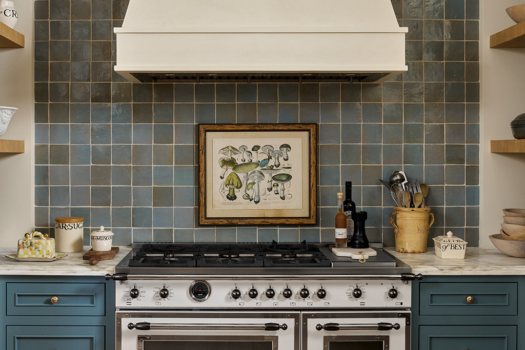
Your decor stands out. How do you choose what to include, and how do those pieces personalize your home?
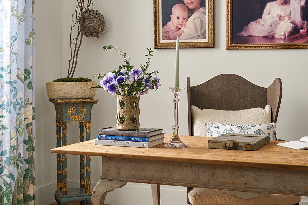
When I furnish a home, I believe in incorporating items with emotional texture—things that feel lived-in and meaningful, even if you don’t know their history. Most of what you see in our home has been repurposed from our previous ones, and many of the standout pieces are antiques with stories. For example, the large cabinet in my study once held a TV and later sat in a dining room. Now it has a whimsical back panel that fits the room’s vibe.
How do you maintain cohesiveness in your design?
I like the home’s entryway to showcase the full color palette, then I weave those colors throughout the main areas, recombining them differently in each room. This helps everything flow well and feel calm.
What are your thoughts on color’s impact?
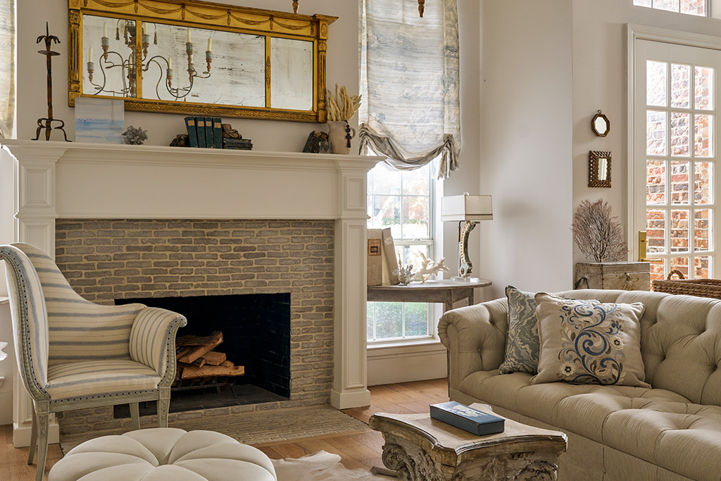
It influences mood, so one of the first things I ask clients is how they want to feel in a space. From there, I choose colors that support that emotional goal. In my home, I incorporated lots of neutrals so our antiques would stand out rather than compete with stronger colors. I tend to work with those all day, so I prefer to come home to something soothing. Overall, the light walls here encourage rest and let a few pieces have that “main character” energy.
Tell us about how you updated your living room:
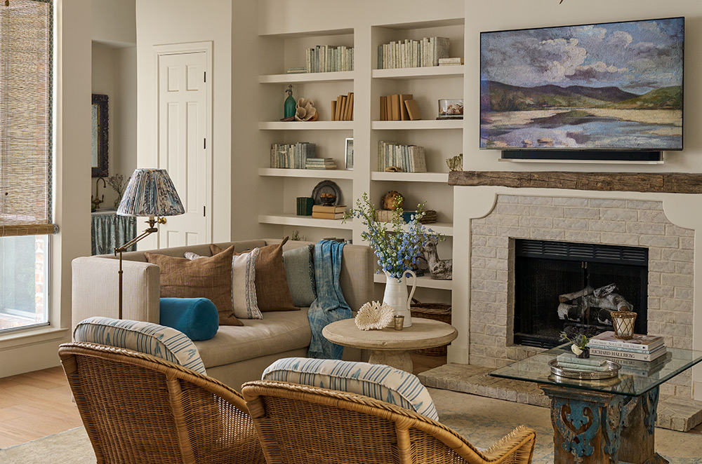
The fireplace originally had pink tile, so we updated it with thin European brick to give it architectural weight. The Trumeau mirror above it, which has been in nearly every home we’ve owned, reflects the Italian chandelier; that reflectivity combines with the softness of the mirror’s frame to make it stand out. I also added a striking blue grisaille painting above it to draw one’s eye.
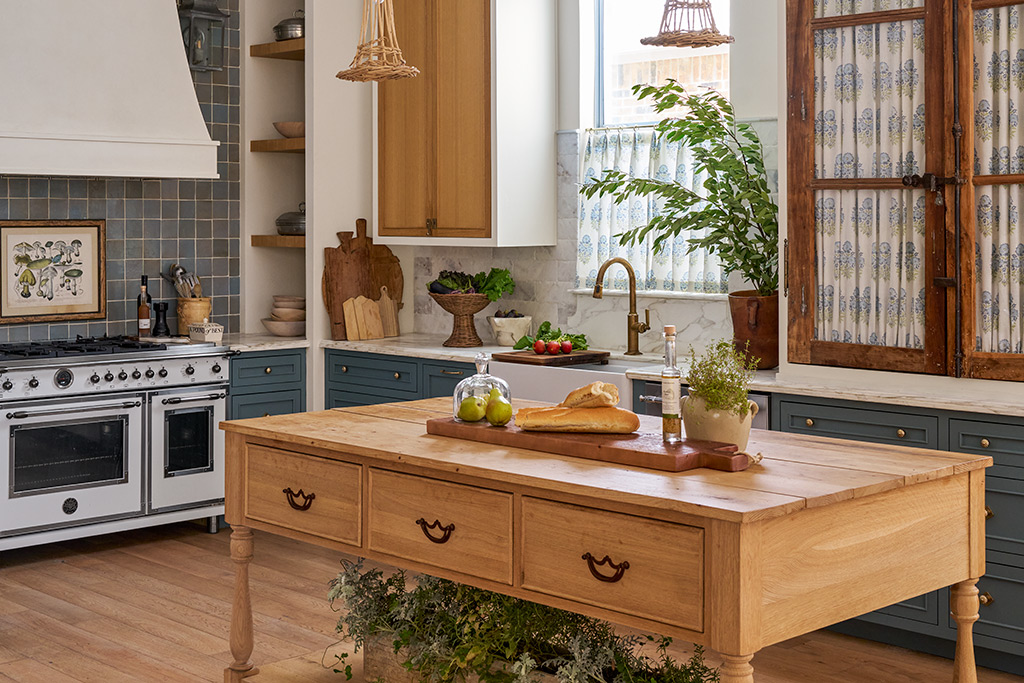
The kitchen also pops. What were you aiming for there?
I wanted a European farmhouse feel, though the layout was tricky: It’s long and narrow, so fitting an island was difficult. But when everyone’s home, the kitchen is the hub, and we needed space for cooking together. The wooden island became the centerpiece. In addition, I added antique French casement windows to the pantry with fabric behind them to hide everyday items. The same fabric is used for the café curtains, a detail I love.
Were the home’s high ceilings a challenge?
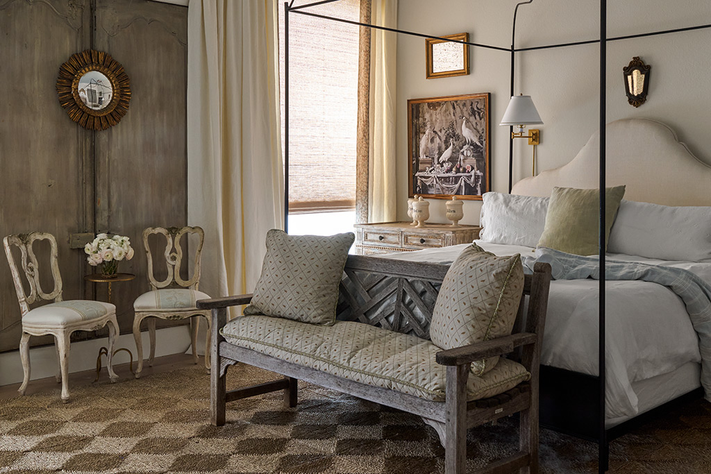
At fourteen feet high, they’re unusually tall for a house this size. That meant I needed to balance vertical elements with horizontal ones for visual stability. I used tall cabinets and headboards and layered artwork to draw the eye up while keeping the rooms grounded and inviting.
What do you love most about the renovation?
Believe it or not, my master bathroom floor. Its combination of antique terra-cotta and limestone is breathtaking. I also love my Bertazzoni range, which is beautiful and incredibly functional. And we recently added silk balloon shades in the living room; they catch the northern light perfectly.

In 2025, you opened your online store, the Edit. What are your goals for it?
Initially, I resisted the idea because we only sell antiques at the Round Top Antiques Fair a few times a year and figuring out the fulfillment logistics was challenging. But people kept asking for a website, so I created one that includes curated collections, both antique and newly made, with thoughtful descriptions. I wanted the experience to reflect my voice, much like chatting about design in my booth, so customers can get a little KMD perspective without hiring me directly.
How is it different designing for yourself versus for clients?
Designing for yourself offers endless options, which can be overwhelming. Every designer I know can envision multiple fabulous versions of a space; the hard part is choosing just one. I enjoy the process, but I also want to reach the finish line. I’m a firm believer that function comes first. Once that’s right, making it beautiful is the easy part.
For more info, visit kristinmullendesigns.com
Ah, the holidays. Shiny ornaments sparkle among pine branches, garland winds gracefully across mantels, and paper snowflakes adorn refrigerators and children’s bedrooms alike.
But if you respond to all this holiday flair with unpleasant feelings—anything ranging from decor-shopping sticker shock to a general disinterest in excessive holiday paraphernalia—then you’re in luck. Options abound for crafting a simple, pared-down decorative scheme that still expresses the spirit of the season.

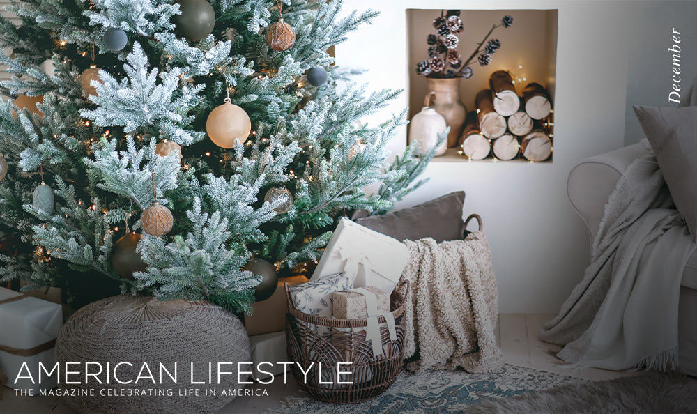
Should you appreciate clean, modern design, you may take umbrage at the multihued decor that stuffs the shelves of holiday trinket shops (and perhaps even your loved ones’ homes). The perfect alternative to such a scheme is a monochromatic one, exchanging red, bright green, gold, and other bold hues for subtle off-white, muted forest green, or other mild shades of your choosing.
Taking this approach will naturally make textural elements like seasonal patterns and diverse materials pop in the space, giving even subdued colors a more refined impact. Designing your holiday tree in this way will offer a particularly chic, contemporary look.

You might prefer going the opposite route, assembling year-round decor that spotlights a season-inspired palette in shades of red, green, or blue. Exchange your pillows, throw blankets, bookshelf adornments, and other smaller objects with ones in these tones for a more surprising take on ornamenting. Just avoid the obvious festive items emblazoned with holiday greetings, instead showcasing cohesive colors. This will express holiday cheer in an understated, perhaps more rewarding way.

Less is often more when it comes to decorating. For a holiday setting that feels classy rather than cluttered, opt to prioritize just a few essentials for the season, such as candleholders, a tree, or garland. Do so, and you’ll have the freedom to invest in higher-quality products that feature the latest decorating styles. For example, consider embracing the “brave, light, and solid” holiday aesthetic that trend forecasters premiered at Messe Frankfurt’s consumer goods fair in Frankfurt, Germany. This approach emphasizes statement decor in unconventional materials: think modernized nutcracker sculptures rather than old-fashioned wooden pieces, for example.

One of the simplest ways to practice decorative restraint that still feels hosting-ready is to only trim the areas of your home your guests will see, like the foyer, living room, and dining table. A few festive touches in these spaces will establish the holiday theme while saving you time and money by keeping your other rooms evergreen.

When you think of holiday embellishments, you might readily picture merry visual elements like trees and baubles, but they can go well beyond sight. What about what you feel, smell, and hear? Try eliciting all these senses in your home instead. For example, turn on a fireplace, set out warm blankets, light diffusers in a winter scent like cinnamon stick or sugar cookie, then play holiday music when guests arrive. You’ll create a complete holiday vibe while your spaces still appear elegantly neat.
Granted, your idea of the holidays may lean toward loud, colorful maximalism, and that’s OK! Trimming your home with holiday tidings is about doing what makes you happy, not just pleasing your guests or meeting social media expectations. But if you’d prefer to practice moderation with your festive decorating, you don’t need to overwhelm your ambience with excessive decor. Just use the aforementioned tips to create a vibe that’s all your own and make the holidays a season to remember.
Breakfast may seem like the most casual meal of the day, but it doesn’t have to be. This set of recipes from the Brunch Club cookbook proves that comforting and classic eats can also be refined and impress your loved ones. Delve into two dishes that are as easy to make as they are to enjoy on a calm winter morning.
You’ve never had potatoes like these—truffle and cheese make them sublime.
A simple bread-based entrée takes on sweet and tangy flavors for a balanced treat.

Recipes from The Brunch Club: Delicious Recipes and Hosting Tips for Feeding Friends by Georgia Hearn. Published by OH. Photography © Danielle Wood 2026.
There is nothing more comforting and special than a plate of tartiflette! It’s decadent, cheesy and indulgent and I hope it transports you straight to any previous mountain trips where you may have partaken of it during après ski. The addition of truffle makes it just that little bit more special.

SERVES 4



Many of us have nostalgic memories of the way we ate French toast as kids. For me, it was in summer with chopped strawberries, a drizzle of cream and lashings of maple syrup. While that still sounds absolutely delicious, I wanted to make a more grown-up version with the addition of vanilla, sumac and mascarpone.

SERVES 4


When it comes to giving gifts, you’ve probably heard that it’s the thought that counts. But there’s a visual component to thoughtfulness as well, including how neatly and attractively you present your present. Do it well, and you can wow the recipient, setting expectations for a jaw-dropping gift before they even unwrap it.
That said, this skill doesn’t come naturally to everyone. If wrapping gifts feels unnecessary or unnecessarily difficult to you, use this guide for successful results.

Event designer Colleen Kennedy Cohen tells the Spruce about the wrapping supplies she always keeps on hand, including the usual essential materials (i.e., gift boxes, paper, and bows) as well as items like craft scissors and gift-wrap tape. However, Kennedy Cohen also includes optional specialty products such as twine, calligraphy pens, and natural toppers like holly branches in her stash to kick the results up a notch. Assemble these provisions, and you’ll be ready to get to work.

Here are foolproof steps for wrapping a gift in a simple box:

Didn’t do the neatest job with your wrapping? Cover any exposed edges with festive stickers, extra ribbon, or adhered decorations like fresh flowers.
Dealing with unusual products that don’t fit neatly into a box or bag? Kennedy Cohen has the answer: Wrap them in soft, appealing fabric, then gather and tie the ends. Or simply place it in a basket, and tie a bow around the handle.
The good news is that this skill is easy to master and will likely become second nature the more you wrap. The best part? The effort you put into your gift wrapping will show in the results—and, hopefully, in the priceless glow in your recipient’s eyes.