
Rethinking Red


Colors play a crucial role in interior design, influencing not just the aesthetics but also the mood and feel of a space. While some create a sense of calm, others add energy and vibrancy, with a single hue—whether used as a dominant shade or a subtle accent—having the power to completely transform a room. And perhaps the most impactful of all may be red in any form, as evidenced by the “unexpected red theory.” Gaining attention in recent years, this approach suggests that even the most neutral spaces can benefit from a pop of warmth.
The underlying logic
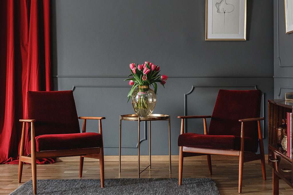
Much of modern interior design has turned toward minimalism, embracing simplicity and clean lines. However, the unexpected red theory brings a fresh approach to the table, proclaiming that for a room to be fully complete, it needs to have a red element somewhere in it. Though this may be a newer trend in decorating, it’s been seen in other areas long before. Think of the famous Christian Louboutin red-bottom shoes or the ever-popular red lipstick. Just as these aspects round out an outfit, a hint of the hue in each space of your home can bring them all together.
But why does it work? For one, red is a color that naturally draws the eye. Having one of the longest wavelengths in the visible spectrum, it is one of the most noticeable colors to the human brain. That’s the reason stop signs are bright red: It makes them hard to miss. Also consider how often you see it in marketing. Call-to-action buttons and limited-time offers are frequently splashed with it to capture consumers’ attention, and a vast number of high-profile companies, including Netflix and Coca-Cola, center it in their branding.
From a psychological standpoint, red has many different emotional associations, including passion, anger, love, and power. When we see it, we may experience a subtle mood boost or feel more confident. In turn, a small dose of red in an otherwise neutral space can add vibrancy and energy to the overarching design.
Red also has deep roots in cultural symbolism. In Eastern cultures, it’s long been associated with luck, celebration, and prosperity. Western art and literature have used red to represent everything from desire to courage. These layered meanings can add depth to your design choices, making the use of red feel intentional and grounded in something larger than aesthetic appeal.
Bringing red into your home
A top benefit of the unexpected red theory is that it can work with virtually any style, from modern Victorian to midcentury modern to farmhouse, since it’s meant to enhance the design rather than overtake it. However, there are a few factors to keep in mind to ensure a successful incorporation.
Start small
Rather than opting for a full transformation right away, look for subtle ways to introduce the color. Imagine a scarlet vase on your mantel, a framed piece of art with crimson strokes, or a book featuring red details placed on your coffee table. These little touches can give you a sense of how the color plays in a room. Even a red candle or a terra-cotta planter can help bridge color gaps and add cohesion. You might also consider incorporating seasonal decor: a bowl of apples in autumn or a red wreath for the holidays.
Focus on accent pieces
Another great way to incorporate red is through your textiles. For instance, you could drape a maroon blanket over a cream-colored sofa or get a rug with ruby threading for your dining room. Patterned curtains with red accents can also make a room feel more dynamic, adding instant warmth without overpowering the existing aesthetic. Accent pillows are another flexible option. You can easily rotate them with the seasons or switch them out when you’re ready for a change. Consider red-hued throws in plush fabrics like velvet or wool to introduce both warmth and texture.
Try a splash of paint
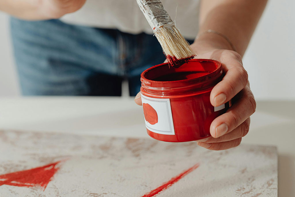
If you’re feeling daring, you can always turn to red paint. Add a fresh coat to your barstools or nightstands. Or cover the insides of your bookshelves in a vibrant hue for a pleasant surprise upon closer inspection. Shades of burgundy work wonderfully in bathrooms and bedrooms, adding a bit of drama, enlivening the spaces, and creating a moody atmosphere. Your options are virtually limitless; it simply depends on how much of a statement you’re trying to make. For example, tomato red or cherry tones can energize kitchens and home offices, promoting creativity and alertness. If you’re hesitant, start with smaller surfaces such as picture frames, cabinet interiors, or even baseboards to experiment without a major commitment.
Carefully select the shade
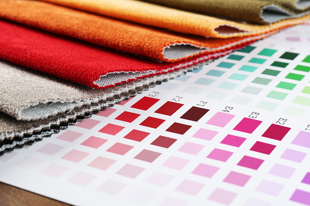
Whatever your approach, keep in mind that the shade of red you choose can heavily influence the overall outcome. A deep wine will create a sense of richness and sophistication, while a bright vermillion can feel playful and bold. And muted, earthy reds like rust and brick can introduce warmth in a more subdued way, making them an excellent choice for those who prefer a softer approach to color.
To pick a tone, consider the type of room (a dining room, for instance, will demand a different vibe than a kid’s room), your goals for incorporating the color into the space, and what option will work best with the rest of your design. It could also be helpful to pick up a few different paint samples you can use to test the look of various hues against different elements in your home before committing to one. Observe how the light in your space changes throughout the day, and how that affects the perception of each red you’re testing.
Ultimately, the unexpected red theory is about breaking decor convention in a way that feels both intentional and effortless. By introducing surprising touches of red, you can give your spaces added layers of depth and interest that elevate each one. When used thoughtfully, red doesn’t just make a visual statement; it transforms the feeling of a room entirely.